Name, Logo & Colors
Brand Identity & Heritage
2020 Rebrand
A New Era of Reading United Soccer
On January 30, 2020, Reading United unveiled new logos and colors as part of a rebranding effort ahead of the club’s 25th season. The new identity acts as a refresh of the previous brand — much of the 2010 effort remains intact, but the marks and palette have been modernized for a new era of Reading United soccer.
The 2020 refresh was completed by Wandel Design.
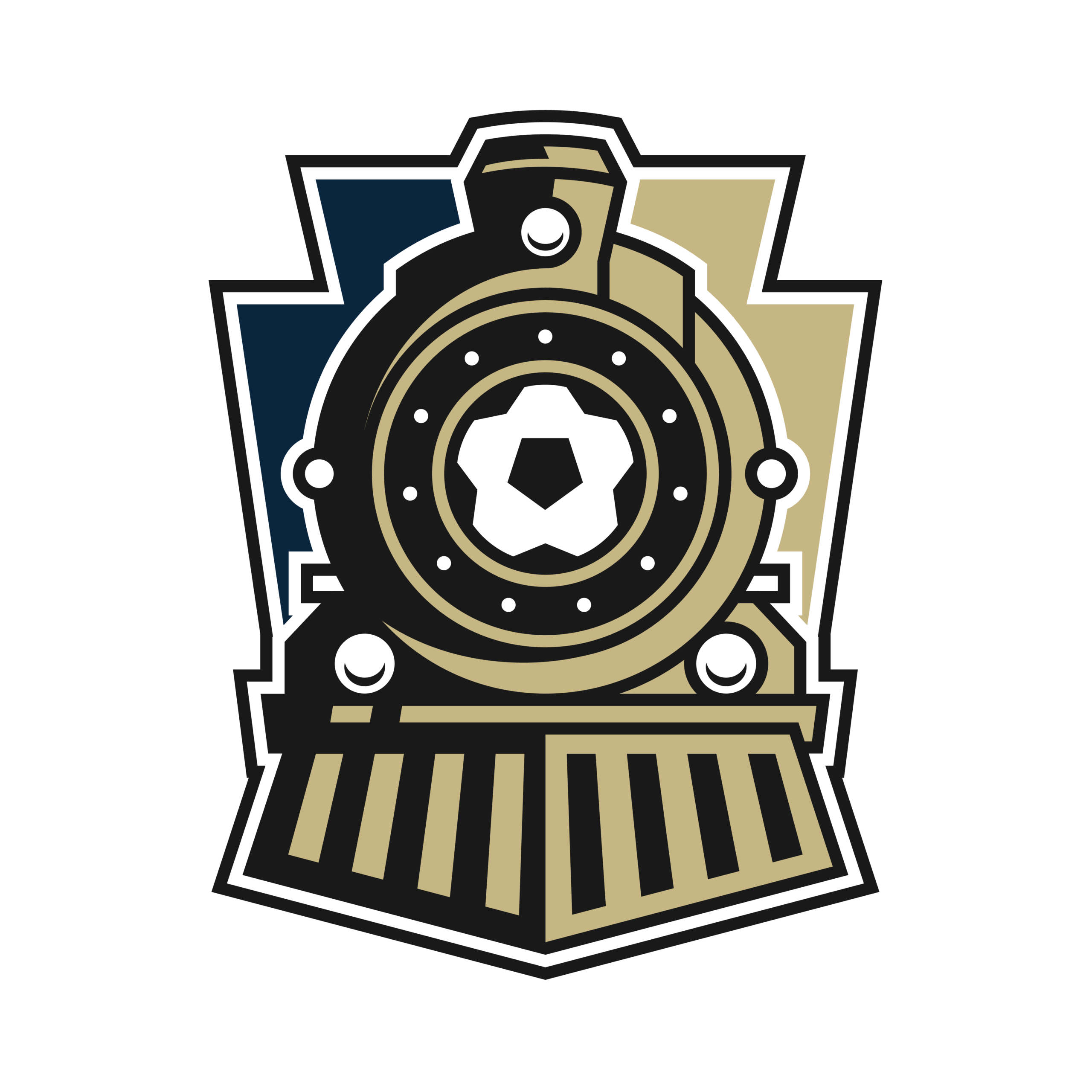
The Crest Family
Three Marks. One Identity.
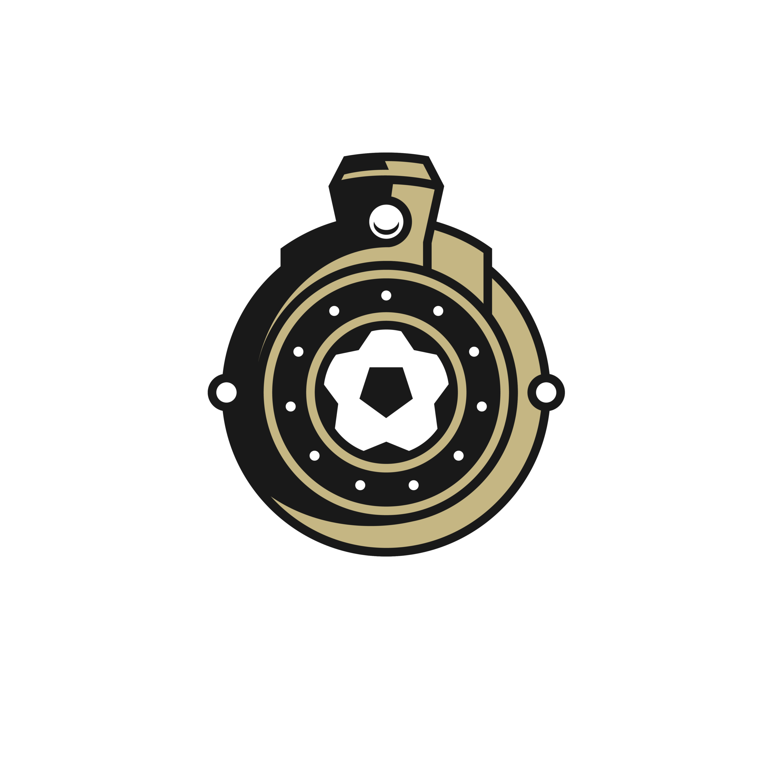
Primary
The full three-color crest
Secondary
The partial crest mark
Throwback Secondary
The 2010 keystone crest
Color Palette
Three Colors. Two Heritages.
Black and gold from the City of Reading seal — and from Germania, one of the first soccer clubs in the Greater Reading area. Navy and gold from the Commonwealth of Pennsylvania.
Charcoal
#1A1A1A
City of Reading. Germania tradition.
Gold
#C6B683
The thread linking Reading, Germania & PA.
Navy Blue
#0B253E
The Commonwealth of Pennsylvania.
The Reading Railroad
A Train at the Heart of the Crest
The train pays homage to the fabled Reading Railroad — one of the first railroads in the nation. Reading was the hub of rail traffic, delivering coal to Philadelphia and the broader region.
By 1871, the Reading Company was the largest corporation in the world. A century and a half later, the engine still drives our story.
Today, Reading United A.C. continues that role — a conduit to Philadelphia — through player development and the pipeline to the Philadelphia Union.
Crest Iconography
Every Element Tells a Story
The Soccer Ball
Set at the forefront of the train — an obvious indicator of the team’s purpose and focus. Soccer leads the way.
13 Stars
Surrounding the soccer ball — representing the 13 original colonies and Pennsylvania’s foundational role in American history.
Shamrocks
Honoring Archie Moylan — former Reading Rage team captain, general manager, and coach — a native of Ireland.
The Keystone
Pennsylvania — the Keystone State. Reading itself a “keystone city” built on rail, steel, and textiles.
Brand Refresh
2010 to 2020
2010
→
2020
Simple
Cleaner lines and a tighter silhouette — easier to read at every scale.
Style
Modernized typography and a refined crest treatment honor the original symbolism.
Color
A richer charcoal, deeper navy, and warmer gold for a more confident palette.
The 2010 identity was created by Berks Professional Sports in collaboration with Launch Dynamic Media. The 2020 refresh was completed by Wandel Design.
The Name
Reading United A.C.
“United”
Unity for the Reading-area soccer community — through club-neutral camps, clinics, and programs. United is also a traditional soccer name that resonates with purists, and a deliberate tie to the Philadelphia Union — the regional pro club we feed players to.
“A.C.”
Athletic Club — a signal that our ambitions reach beyond a single sport. The name reflects partnerships with broader athletic programs (like Body Zone) and a club built on competition, community, and athletic excellence.
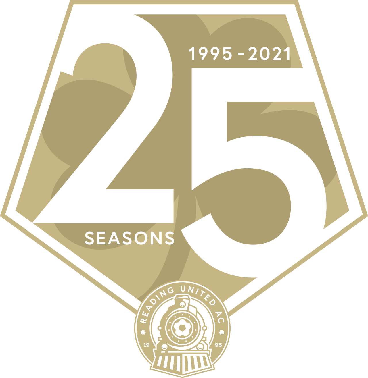
25 Seasons
R U Ready?
Reading United A.C. is a minor league soccer club in USL League 2 — a quarter-century of player development, community building, and Reading pride.